Telia Min Bedrift
In 2020, Telia wanted to be establish themselves as the prime ICT-provider for Norwegian enterprises.
They wanted to achieve this by helping their customers communicate effectively through a connected digital infrastructure — Phones, mobile subscriptions, fiber, VPNs, TV, 5G-powered IoT devices — Telia would be the place to get all your needs covered.
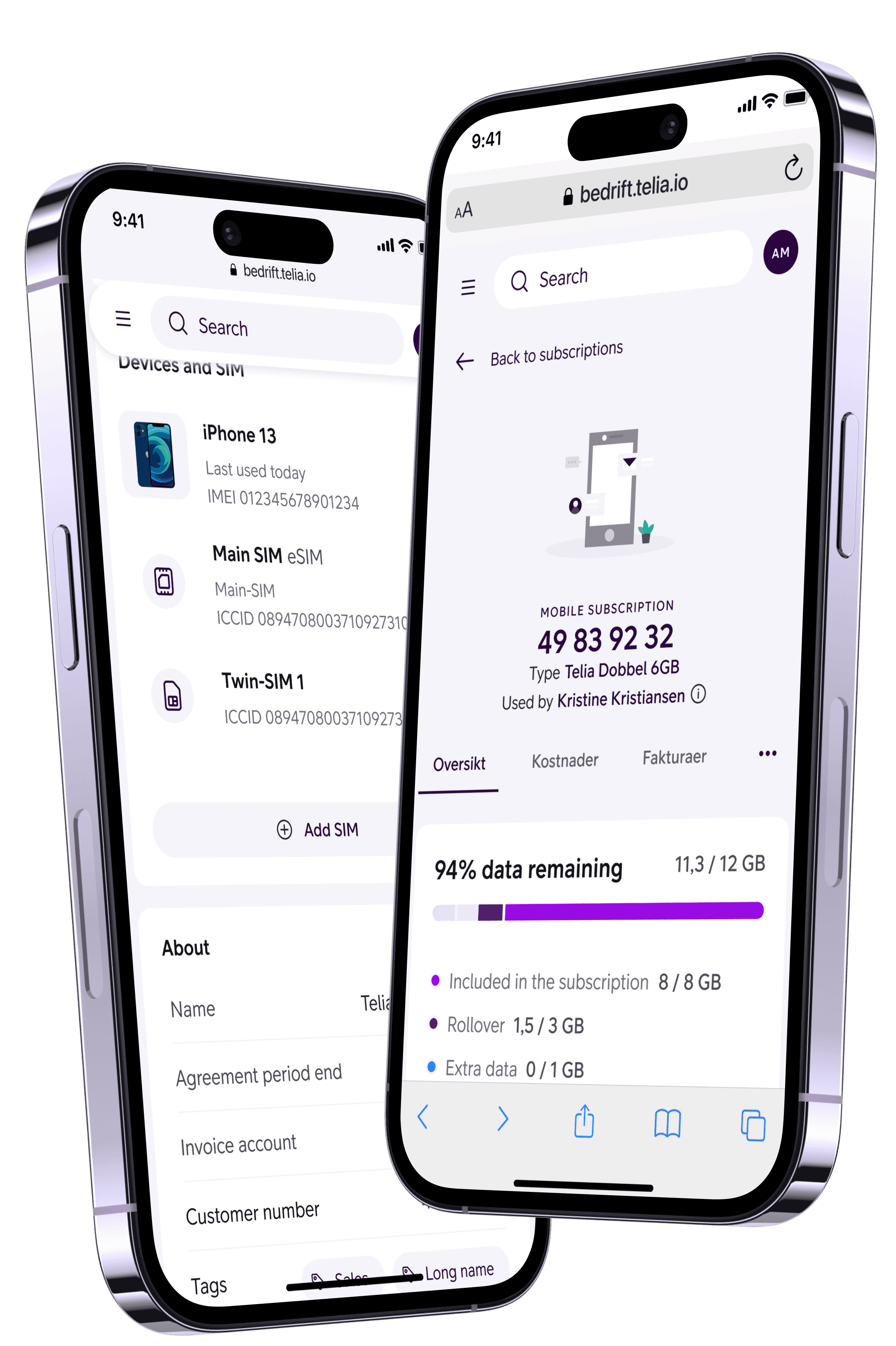
As lead designer in a cross-functional product team, I worked to create a holistic self-service platform to equip people in 26 000 enterprises with the tools they need, and empower them to keep things running smoothly.
Role
UX Lead
Created with
Telia Norge and Bredvid
Work
Product strategy, UX research, Prototyping, Graphic design, Workshop facilitation, Coaching
Link
Backdrop
Through talking to customers, we learned about their challenges and issues. We discovered that a majority of their frustrations stem from things not being coherent.
“When I make a change in one of your systems, it doesn’t affect my mobile subscriptions in the other one. I have to keep copy-pasting to keep things in sync. It was annoying in the beginning, but I've gotten used to it by now.”
- Anonymous user 3
"When working on stuff I have two screens up at the same time; one with the current Min bedrift, and two excel-spreadsheets on the other. I tend to download data from Min bedrift, and that goes into a third excel-sheet. Then i have notepad — well, notepad++ is what I’m using — to take some notes and write summaries while I’m working. It’s a strange way of doing it I guess, but it’s how I get it done."
- Anonymous user 4
“I want to teach myself how to manage all of this better, but I just don't have the time.”
- Anonymous user 6
We observed that when self-service products are available, our users had to update a lot of information in multiple systems. The experience was fragmented.
If no systems existed, they used excel, emails, phone calls or their internal connections at Telia to manage their products and services for them.
This fragmented experience increased the workload, and raised the threshold for self servicing. Our users felt overwhelmed by the work, and it was time-consuming. It was easier to have Telia perform manual work for them, or to not do anything at all.
This also had a nasty side effect; Our user blamed themselves for the poor experience. They saw the potential for this working well, but still felt like they were at fault for not putting in enough effort.
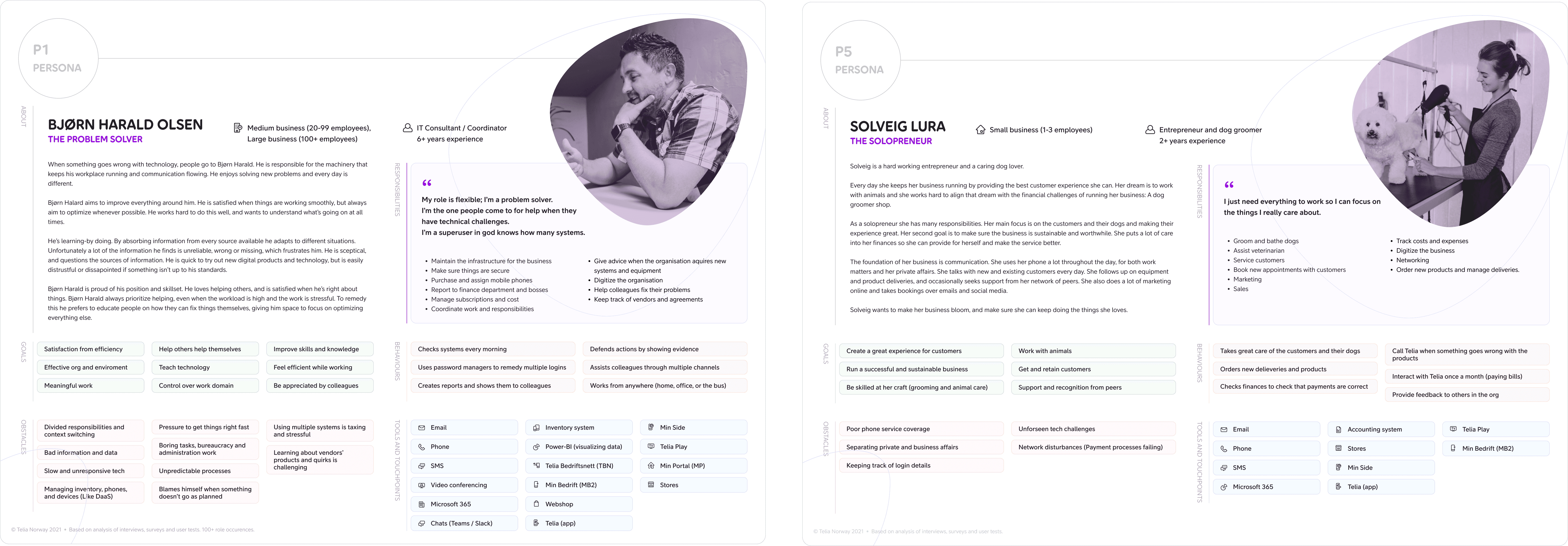
Two of our users. Anonymized.
Opportunity
How might we empower people in Norwegian enterprises to experience coherent control of their digital communication?
We believed that by building a product around our users mental models and how they looked at their organizations and needs, we would improve the user experience and create sensations of safety, coherence and trust.
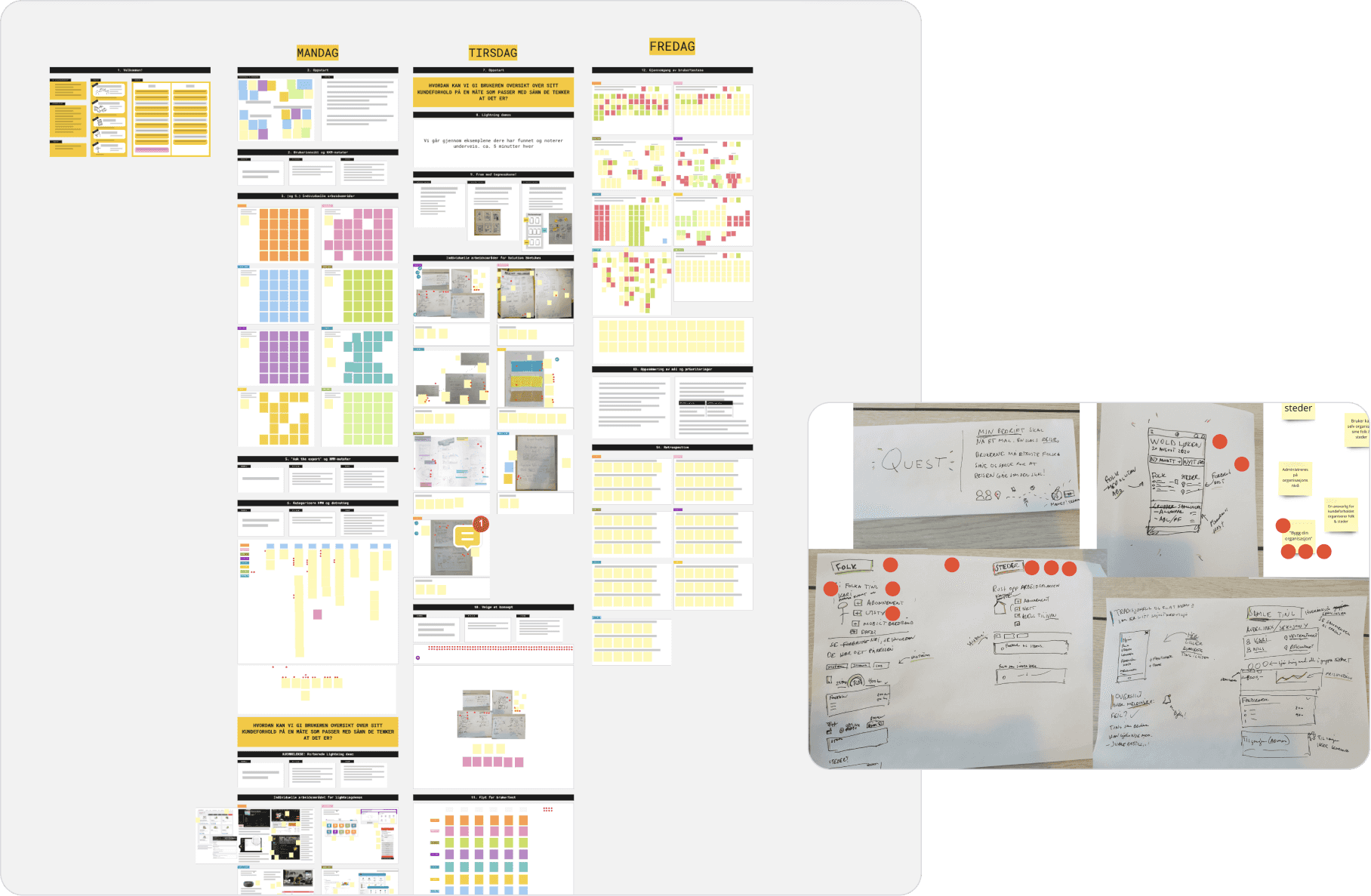
The aftermath of our initial team workshop.
Testing
We challenged our assumptions through multiple iterations of prototyping and testing. We quickly discovered what we got right, what we got wrong, and adapted to what we learned.
We found that our initial assumptions were on the right track, but we discovered nuances that helped us tweak the product to attain better product-market fit.
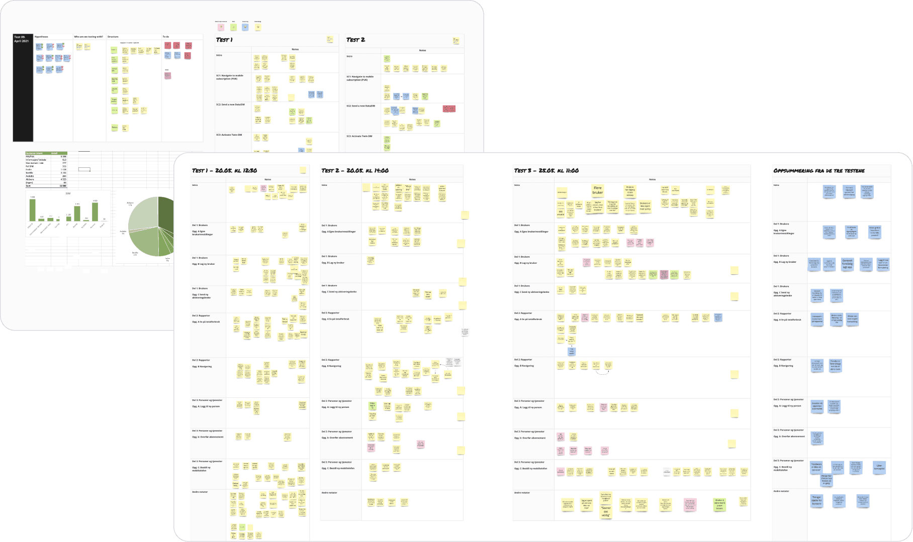
Notes from a set of user tests.
Since the product is built around the customers lasting constructs — their departments, their places, and most importantly, their people — it's likely to remain a robust platform in the future.
Over time it could enable customers to manage the entirety of their digitial communication needs. All from their own perspectives, and around their needs.
This would enable Telia to adapt future products around their customers. It would secure them with a value enabling, sustainable service platform for years to come.
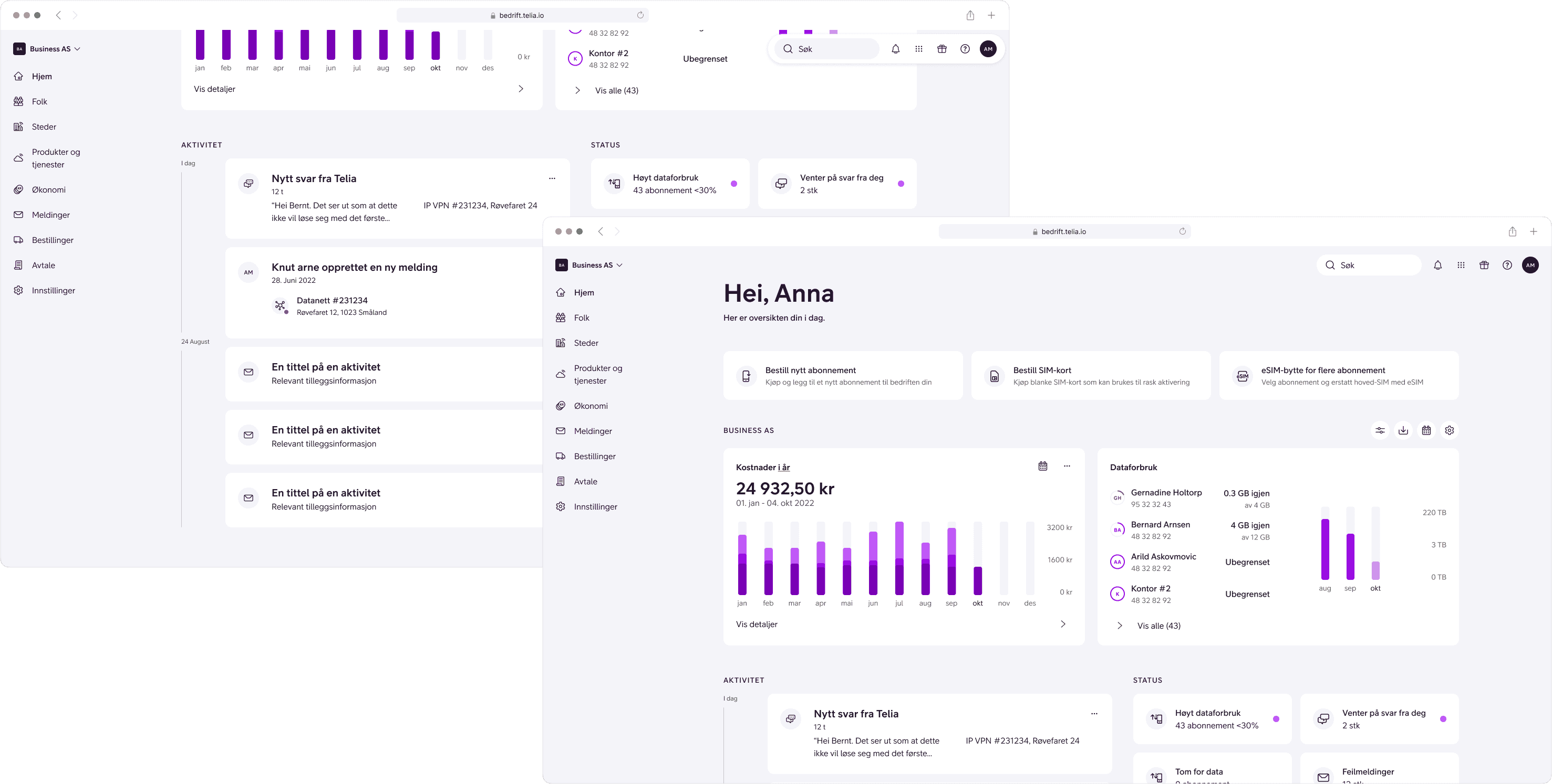
Empower people to communicate efficiently.

Manage people, places, products, orders and spendings.
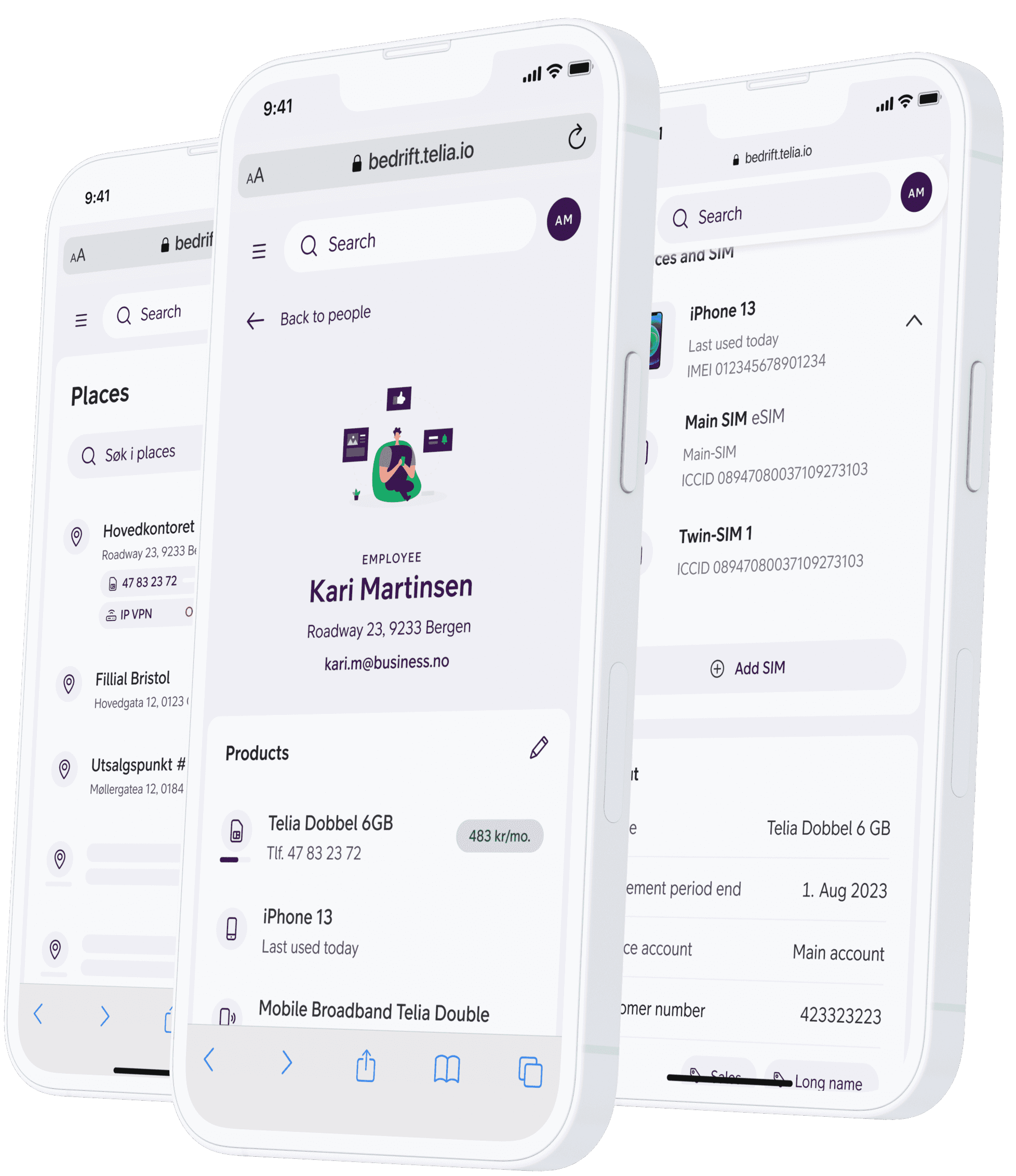
Telia Min Bedrift
Multiconsult - Energy loans
Multiconsult are engineering experts.
In spring 2022, as energy costs were starting to soar, they wanted to use their expertise to help people make meaningful changes to their homes instead of surface-tweaks and beautification.
One way of doing this was incentivising sustainable renovation through green loans with low interest rates, and by spreading awareness of energy savings.
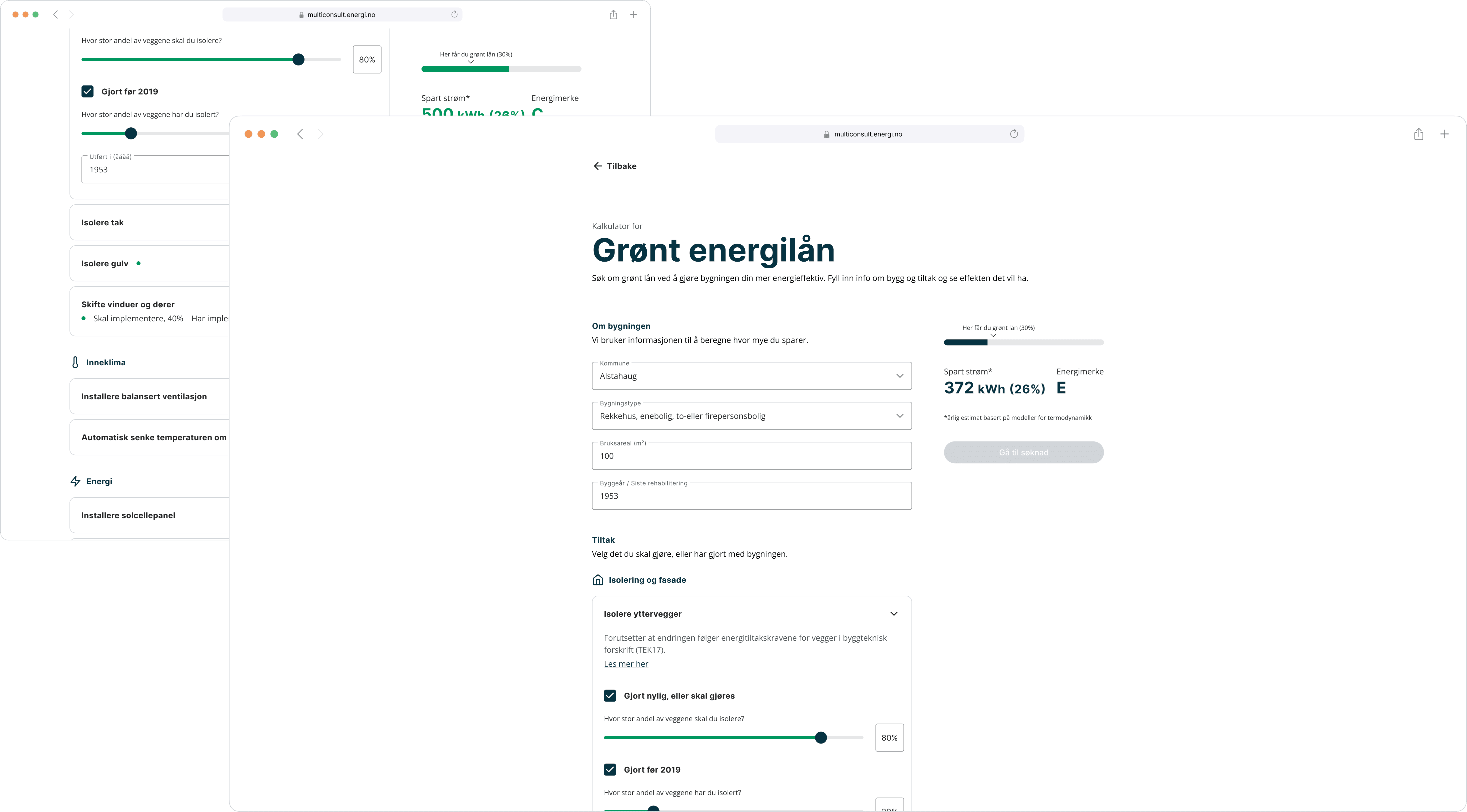
As part of a two-person team, I designed a product to help people evaluate how sustainable their renovations efforts would be, and to assist them when they apply for loans.
Role
Lead Product Designer
Created with
Multiconsult and Bredvid
Work
Workshop facilitation, UX research, Prototyping, Graphic design
Backdrop
Through research and analysis, Multiconsult knew about the drawbacks with current renovation trends.
When people were renovating, they tended to spend more time and effort on surface-fixes instead of sustainable change. This was largely due to surface-renovations being perceived to be cheaper, require less effort, and still having a large impact on property-prices.
Multiple banks had already started providing people with financial incentives to change this behaviour. They called these incentives "Green" energy loans; Loans with lower interest rates in return for making meaningful renovation efforts.
Applying for these energy loans wasn't easy, though.
First you had to figure out if your renovation would have an impact on energy savings. Then you had to actually provide evidence to the bank after the renovations were done. If you couldn't, they wouldn't be able to reduce the interest rates.
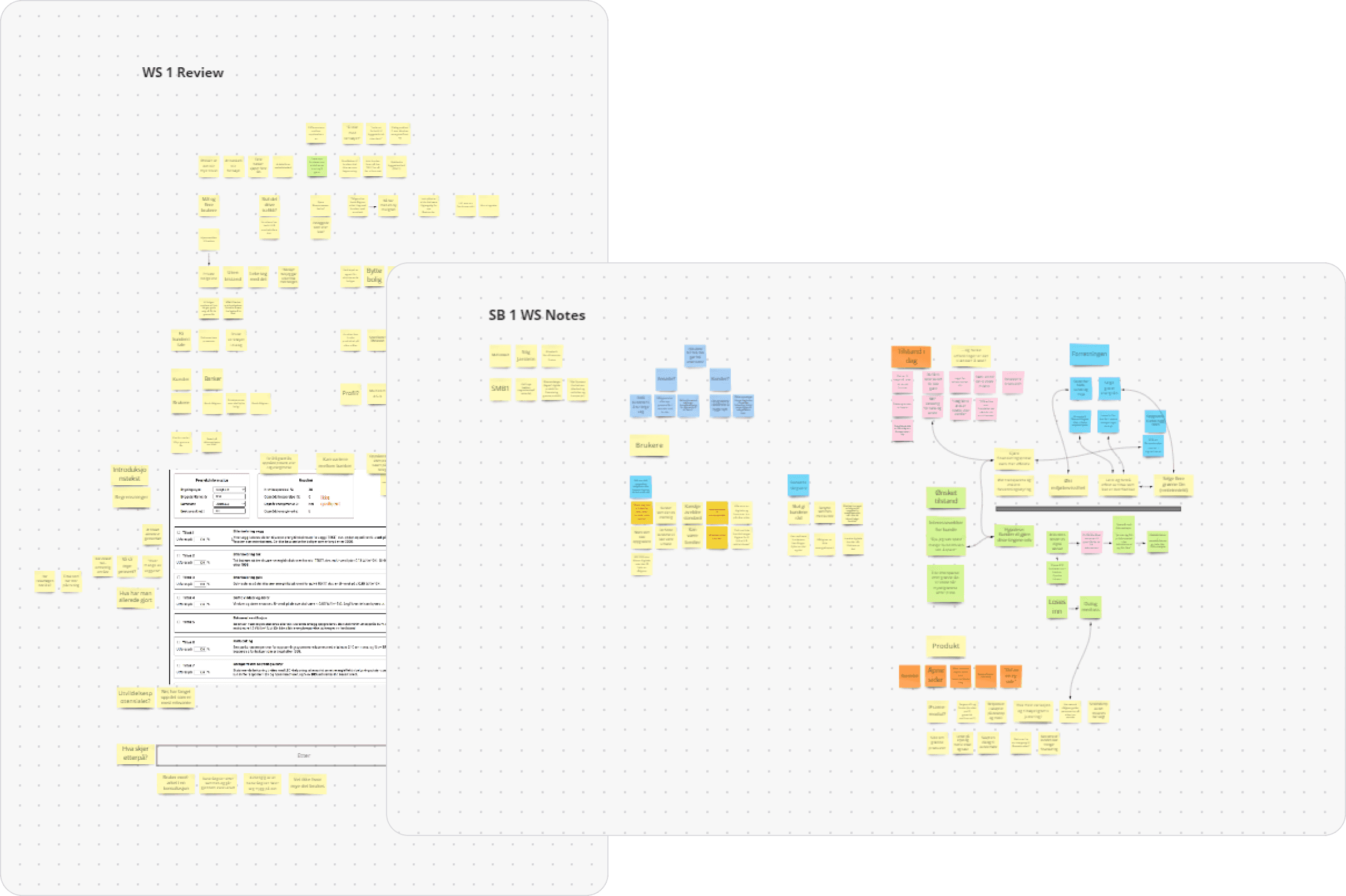
Sticky notes from two of our discovery workshops.
Opportunity
As a first step, we set out to help them deal with the first problem.
How might we help people know how impactful their renovations efforts would be up front?
We investigated approaches, and created a product that aimed to help people with estimating the effects of renovation changes on energy consumption.
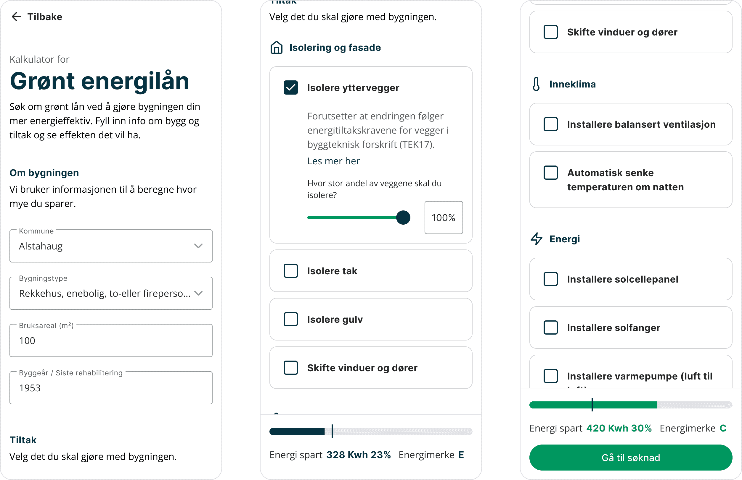
Show people how much they are likely to save.
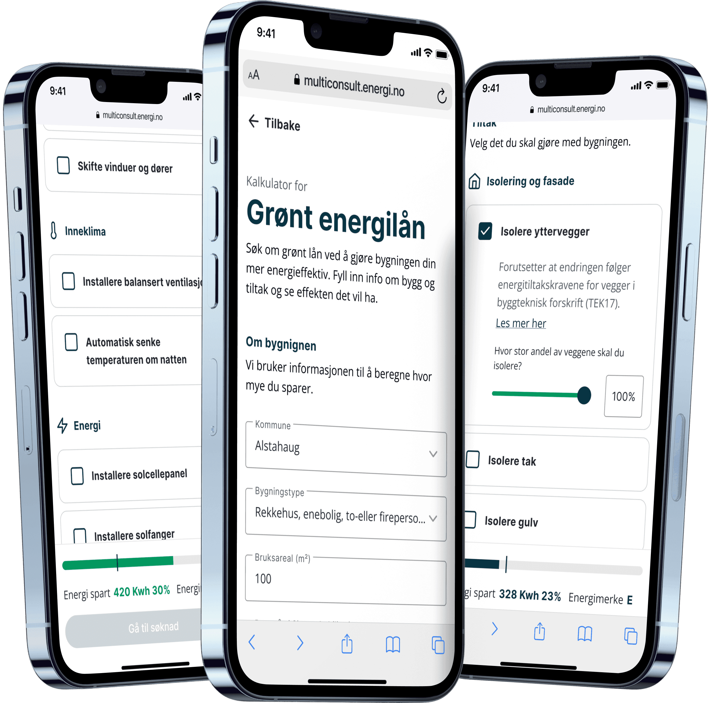
Green energy loans
